


Design/Art/Creative Director
kevin@kevinbarclay.com
Design/Art/Creative Director
kevin@kevinbarclay.com
Wills Eye
Wills Eye
The Challenge
increase the profile of a RENOWNED eye hospital
For forty years Wills Eye Hospital has consistently been ranked one of the top three ophthalmology hospitals in the United States by U.S. News & World Report and its residency program is considered one of the most competitive programs in the world. Our job was to take them to the top and stay there.
The solution
See how they see
We asked, what would it be like to get into the heads of a recognized authority to reveal that catalyst? On the site a user rotates a stylized iris with each radial furrow featuring a specialist. U.S. News & World Report surveys ophthalmologists exclusively so the language could be elevated and these successes are told through the voices of the doctors, staff, and patients supported by photoessay-style imagery overlaid with real ambient sound.


PepsiCo
PepsiCo
The challenge
an UNPARALLELED opportunity
A company with a presence in nearly every country has an unparalleled opportunity—and responsibility—to drive global impact. PepsiCo’s sustainability website, built around its pep+ (PepsiCo Positive) strategy, showcases the company’s commitment to building a more sustainable food system by embedding environmental and social goals throughout its operations, supply chain, and product portfolio.
The solution
Be comprehensive and transparent
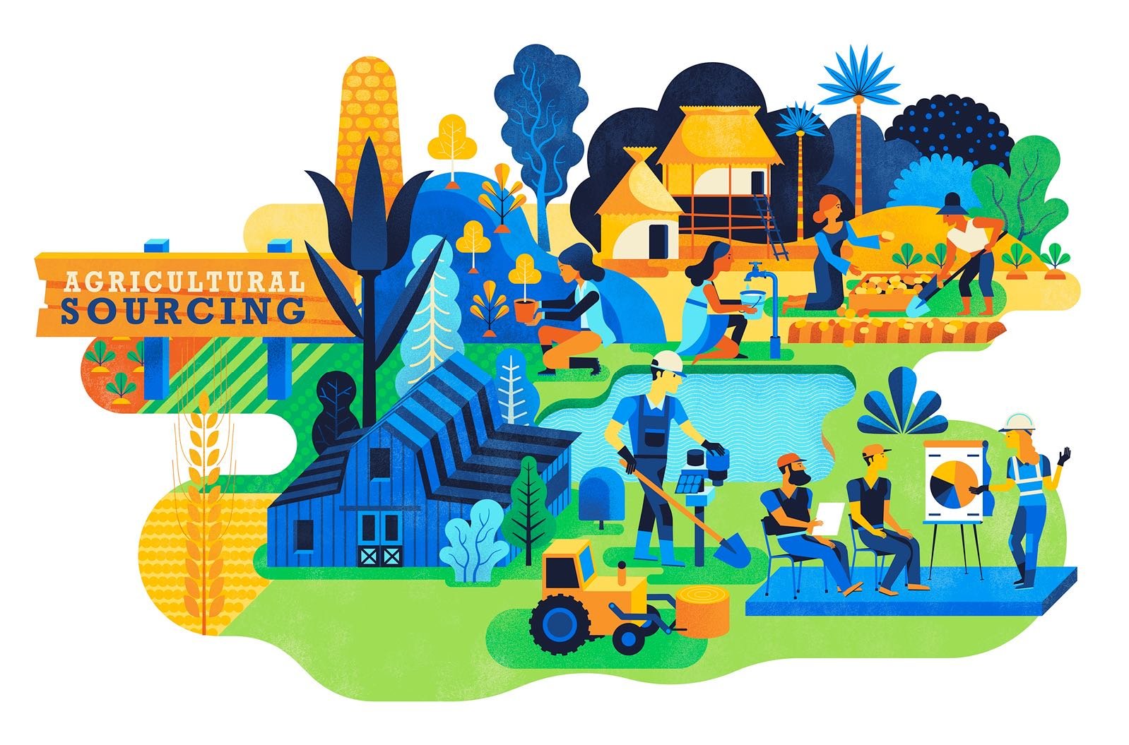
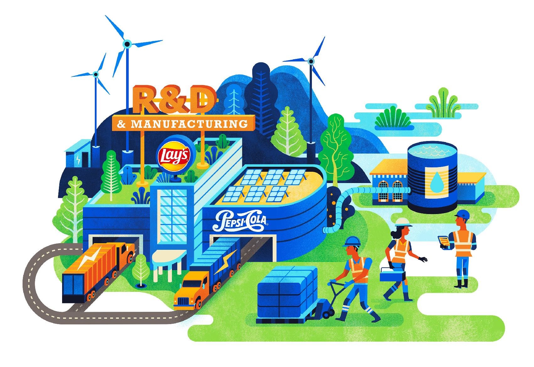
We developed PepsiCo’s comprehensive sustainability website around five key pillars: Agriculture & Sourcing, Products & Nutrition, Environmental Impact, People, and Strategy. To amplify the message, we also created an animated video that highlighted the core themes—later adopted by several of PepsiCo’s billion-dollar brands to support their own communications efforts.


AT&T
AT&T
The Challenge
Position a fortune 50 company as a leader in sustainability
AT&T is the world's third largest telecommunications company and has a successful sustainability story to tell. Our role was to amplify that story to a specific audience through web, and IR reporting.
The solution
AI generated solution to answer any sustainability question
We proposed a stand alone AI-first website GPT model using natural language processing to generate summaries of complex sustainability issues from long format documents. Messaging echoed through all touchpoints including AT&T’s annual report and sustainability summary.
Annual Report


Sustainability Summary

Meta
Meta
The Challenge
3.29 billion people are watching
Meta's Human Rights messaging outlines the company's efforts to identify, address, and mitigate potential human rights impacts across its platforms globally. It promotes transparency and accountability in how Meta manages issues like privacy, freedom of expression, and user safety. 3.29 billion people use at least one of its core products daily, and 3.98 billion people use these products monthly. For context roughly 40% of the world’s population uses a Meta product every day. Needless to say it is one of the most important documents it publishes because their family of apps touch so many and is scrutinized by NGO’s as well as governments.
The solution
don’t disappoint them
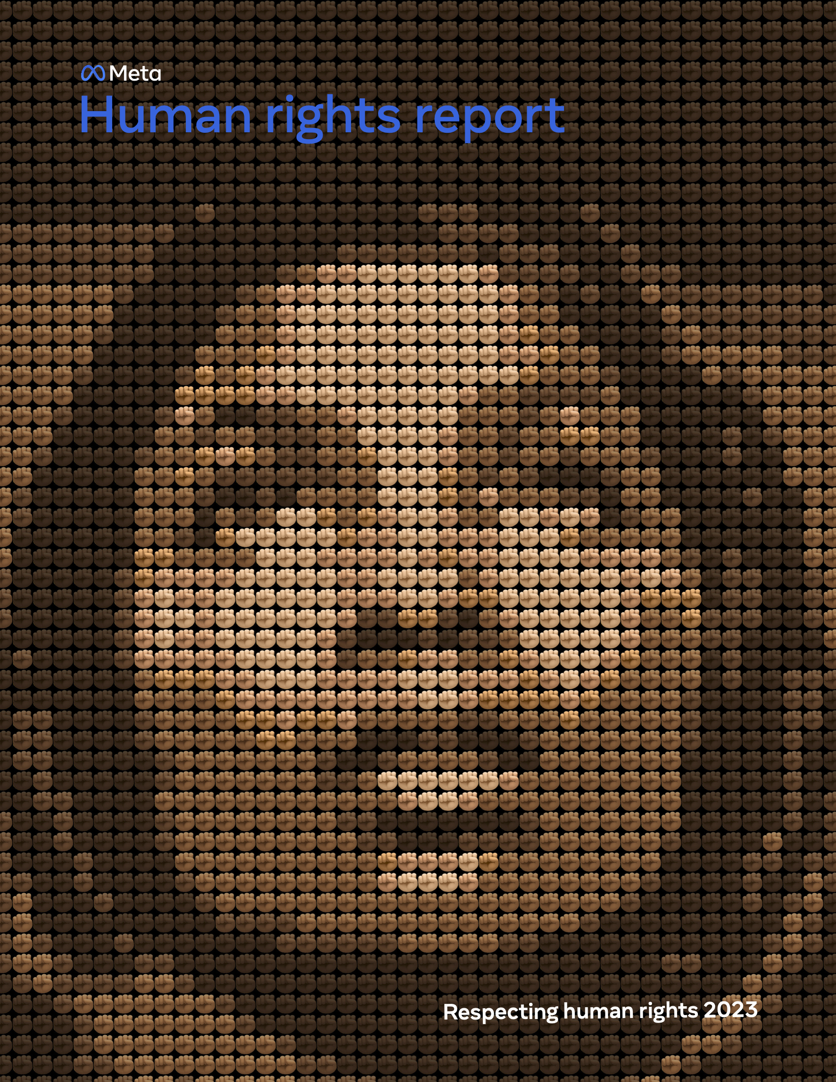
A raised fist is often associated with peaceful protests. Using Meta’s famous hand emoji as a multicolor pattern, we created a woman’s face that reflects the global and inclusive nature of the company’s mission. An accompanying website was developed to be highly user-friendly, allowing seamless navigation through complex topics. Data-heavy content was thoughtfully organized with clean layouts, intuitive infographics, and interactive elements to make the material more engaging and accessible to those 3.29 billion.
Amazon
Amazon
The Challenge
The world’s largest online retailer gets a lot of attention
Opinions on Amazon's sustainability vary, with some praising its renewable energy initiatives and carbon-neutral goals, while others criticize its environmental impact from packaging, shipping, and data centers. Our goal was to swing those in between.
The solution
but you Can’t argue with data
Storytelling often fails to convince people because it feels anecdotal. In contrast, confirmed data can persuade even hardened skeptics. Presenting complex issues clearly, backed by solid data, was our path forward.


Save The Food
Save The Food
The Challenge
40% of food is wasted in America
It's a shocking statistic that few know. Our first goal was to educate by highlighting the enormous environmental effort it takes to bring food to our door. The larger task was to change behaviour.
The solution
a fully integrated campaign committed to long term change
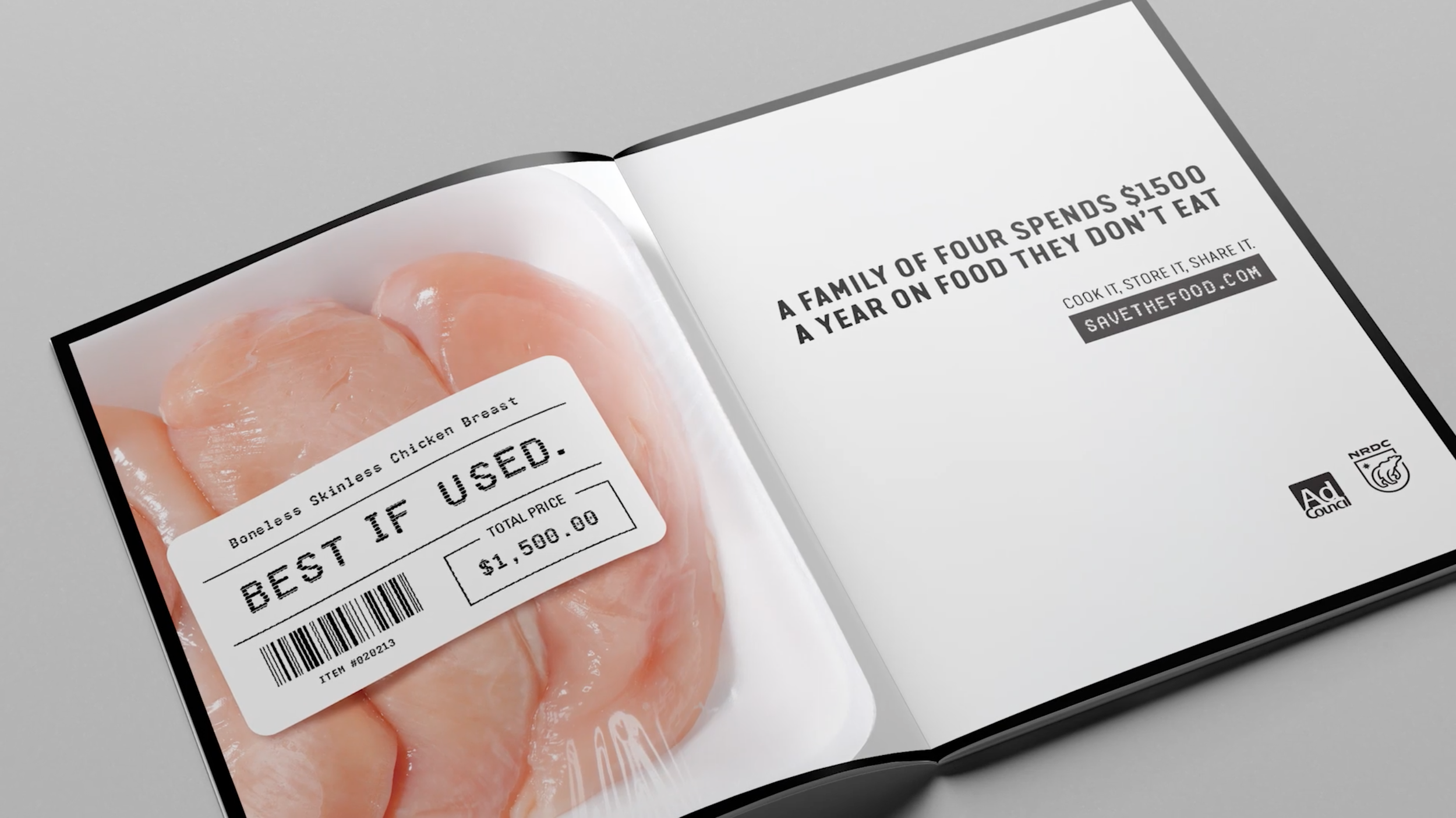
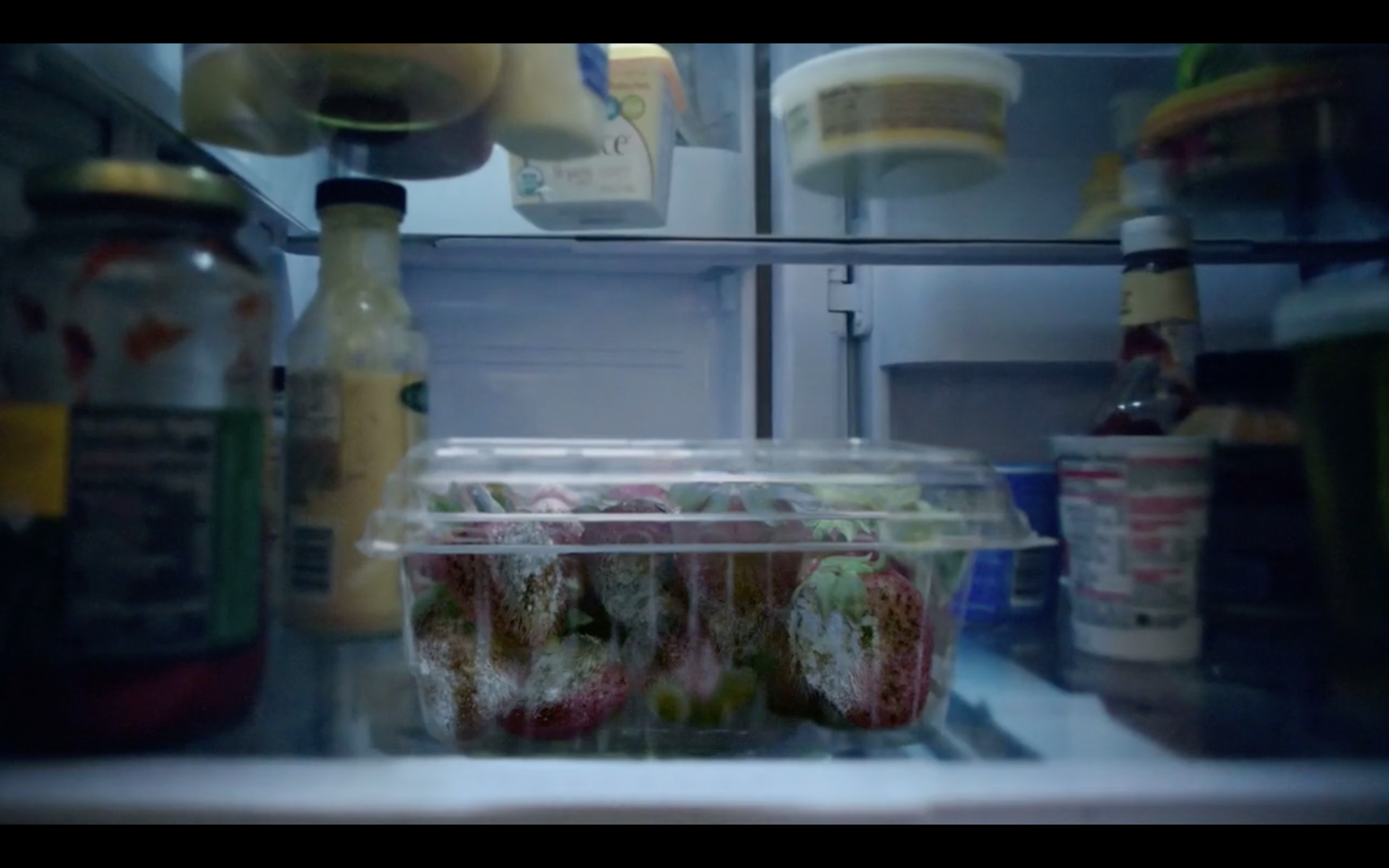
Partnering with The Ad Council and Publicis Sapient, NRDC launched a Save the Food brand to directly address food waste. A cross platform "Best If Used" awareness campaign also included education, tools and hints online and off. We partnered with Amazon to provide STF functionality to Alexa so that the AI tool can dish out advice on smarter food storage, tips for evaluating whether something is still safe to eat, and tricks to revive food that's past its prime. We worked with Disney to contribute the Oscar and Grammy award winning soundtrack and enlisted renowned chef, Dan Barber, to create gourmet meals for unsuspecting foodies made from food that would normally be tossed away. I was client CD on this project.


International Paper
International Paper
The Challenge
Rebrand the world’s largest paper company
Rebranding International Paper involves transforming a legacy brand into a visually compelling and emotionally resonant identity that reflects innovation and sustainability. We needed to craft a modern aesthetic that honors the brand’s heritage while appealing to a global, eco-conscious audience. The challenge lies in developing a cohesive visual language—logo, typography, color, and packaging—that feels both timeless and forward-looking across all touchpoints.
The solution
position for what’s next
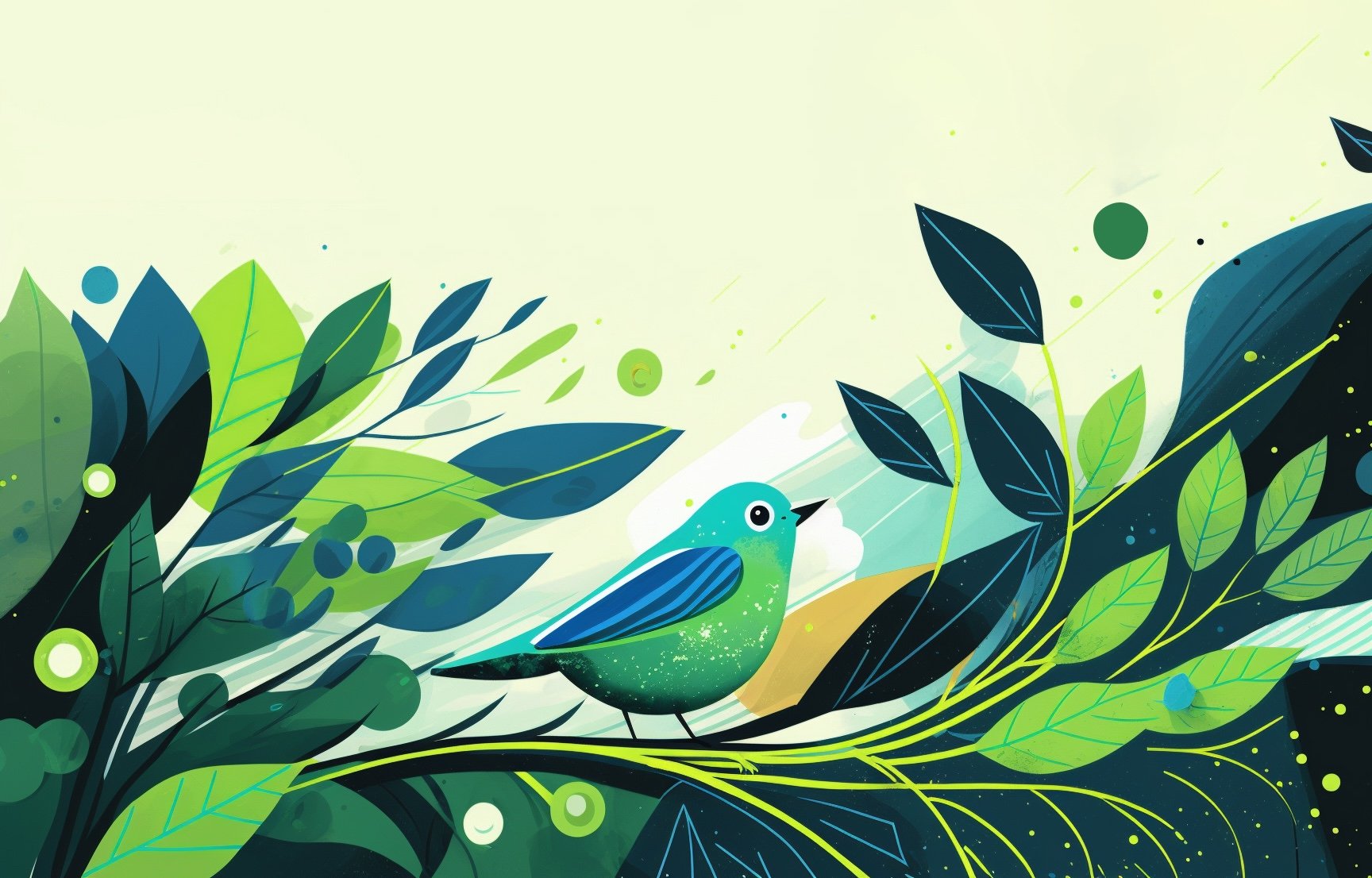
The design solution for rebranding International Paper focused on creating a modern, unified identity that honored that legacy. The logo reflected a “leaflett” to reflect the natural foundation of the company. A nature-inspired color palette, clean typography, and AI created imagery were implemented to reflect the company’s global presence. Comprehensive brand guidelines were developed to ensure consistency across all markets and sub-brands while allowing flexibility for regional adaptation. This approach successfully repositioned International Paper as a forward-thinking, purpose-driven leader in sustainable materials.

Customized terminals and crossbars of the logotype to include part of the icon “leaflet”


AI generated vector illustration as part of the global rebrand. We supplied the templates and set AI prompts for in-house consistency.


City Relief
City Relief
The Challenge
Update a beloved new york city brand
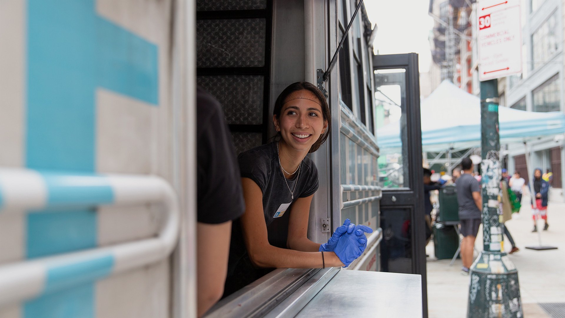
City Relief, formerly known as New York City Relief, is a mobile outreach organization that provides people experiencing poverty and homelessness with hot meals, essential supplies, and connections to housing resources. As the organization expanded its mission beyond the five boroughs of New York City, a name simplification and brand shift were necessary. Now operating as City Relief, they are widely recognized for their modified school buses, which park at designated locations in targeted cities. These are typically inner-city or downtown areas—an environment that inspired the revitalized brand.
The solution
Reflect the city’s hopes and challenges
The elongated brandmark reflects an optimistic, upward-moving city skyline, but also—when viewed as though looking down on a roadmap—a maze-like streetscape that symbolizes how difficult cities can be to navigate for the most vulnerable.
The color selection was intentionally welcoming, open, and positive, while the supportive typography is contemporary yet restrained, ensuring maximum legibility for those in need.


Citrix
Citrix
The Challenge
Define redefining
Citrix is redefining the future of work in a way that benefits the planet, their business, and society. As true as that is, customers are hearing that a lot so how can we differentiate their narrative from others?
The solution
metaphorically speaking
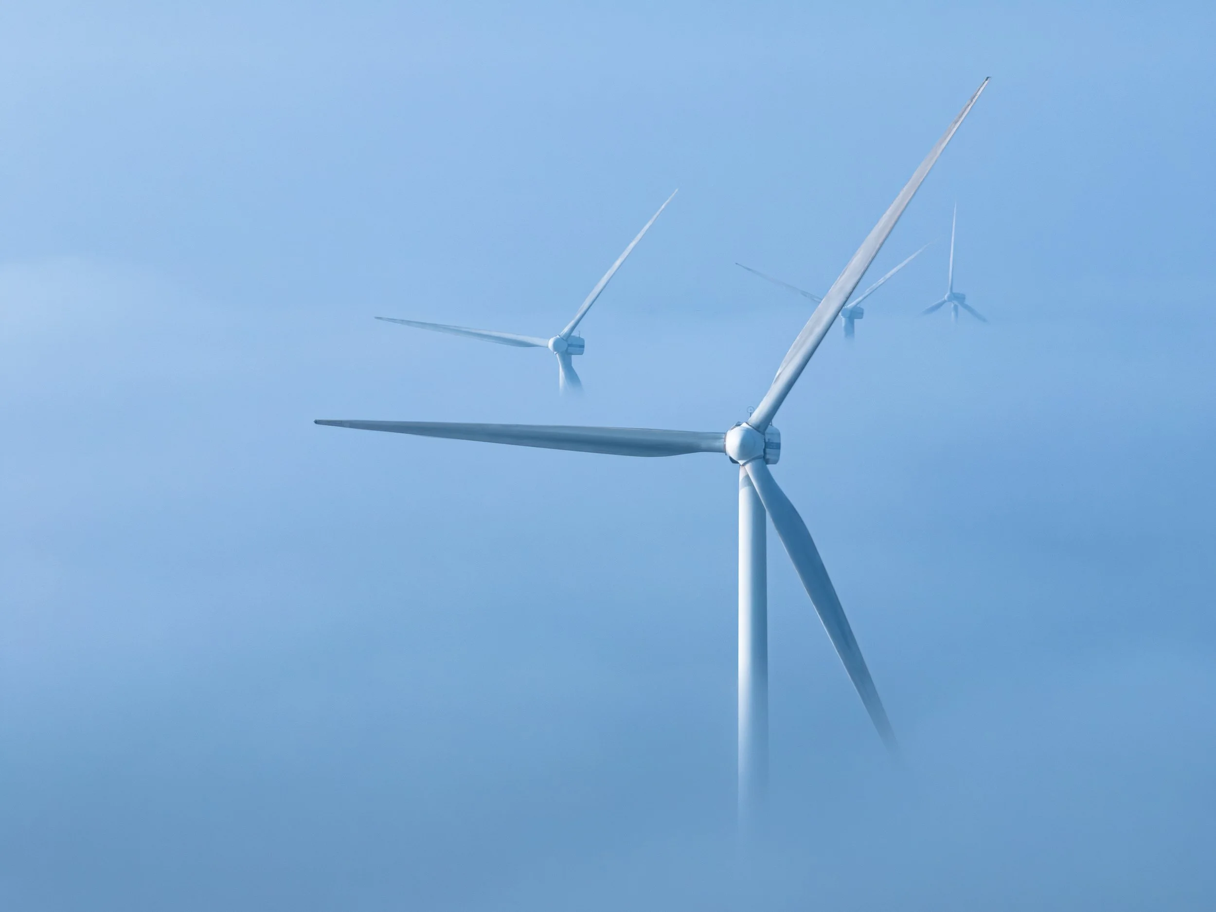
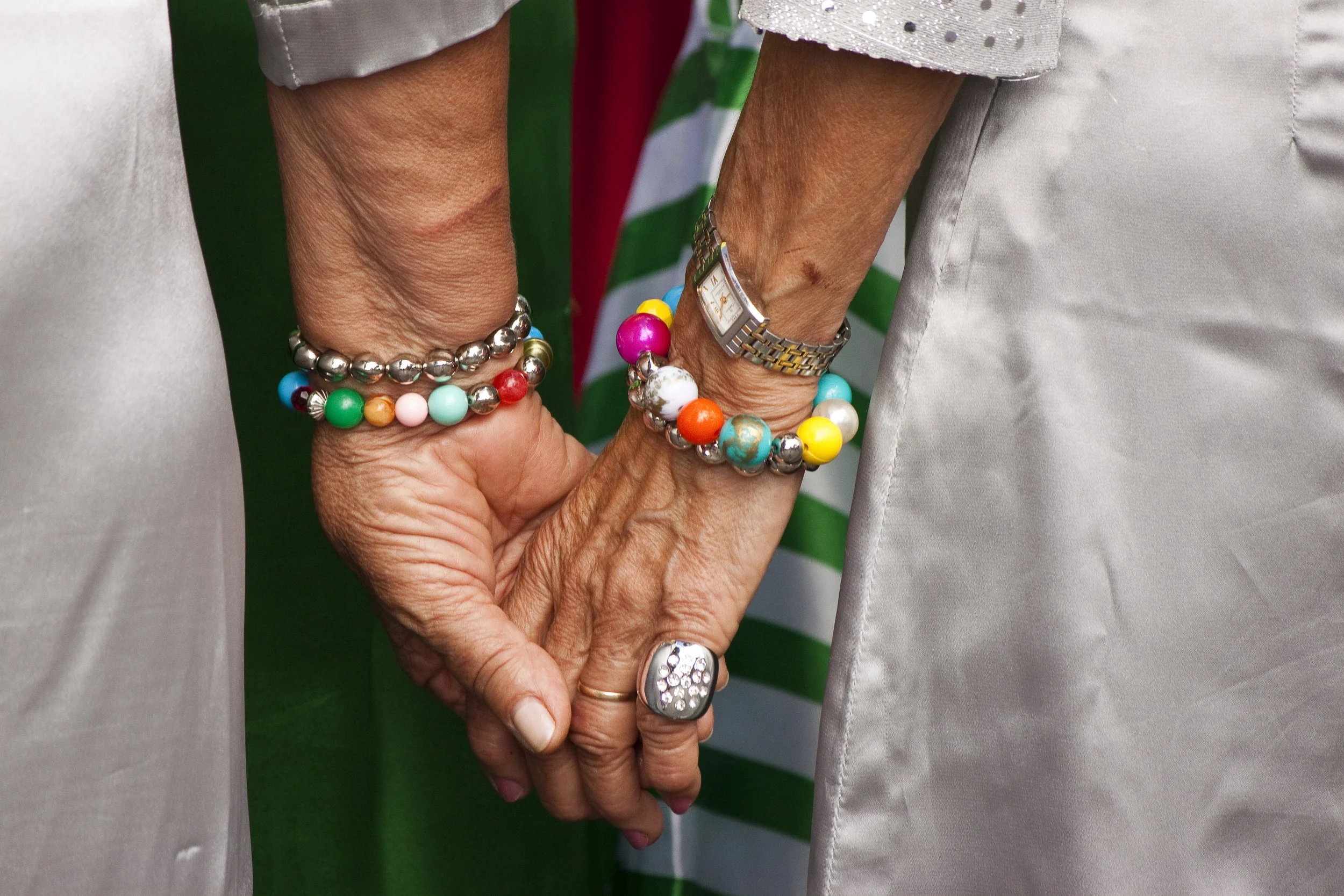
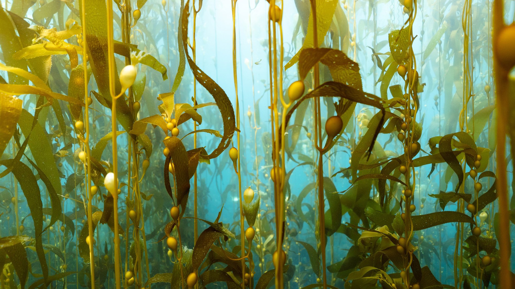
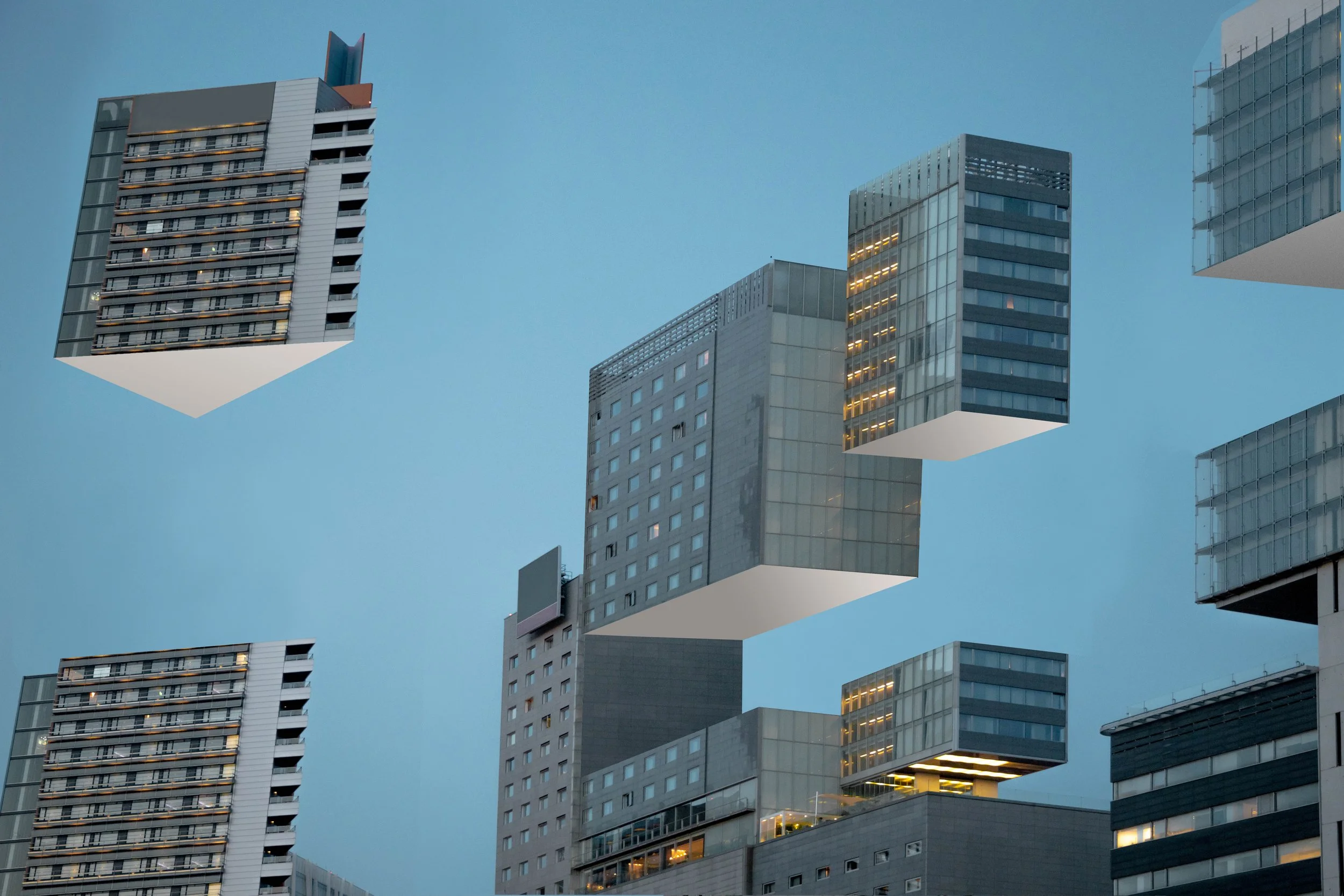
Sustainability imagery can be repetitive (another wind turbine, any one?) but there are unique ways to tell similar stories: find the essence of each message and present it visually.

Turning photos into data


How can we visualize the widespread benefits of working from home? See the full experience here.